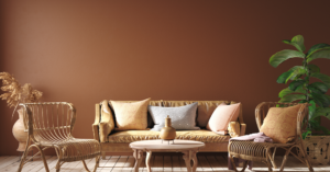
Today’s paint trends have most of us painting white walls in white kitchens with pops of grays and blues spread throughout the rest of the house. If you’re planning to paint an aging-in-place home, however, steer clear of soft colors that blend from one room to another. Instead, look for a mix of high-contrast paint colors that break up each room.
Why Are High-Contrast Colors the Right Choice for the Aging-in-Place Home?
It’s not a surprise that as we age our eye-sight slowly deteriorates and eyesight issues can start to emerge. Over time, certain colors become harder to recognize. Cool colors, like blues and purples, tend to fade sooner than warm colors. An older adult’s depth of perception also begins to drastically decrease and sensitivity to light starts to increase. Combine all of this and you can see how getting around a home safely is a lot harder for the aging-in-place adult.
Painting different areas throughout your home with high-contrast colors is an easy, cost-effective way to help older adults combat some of these eyesight challenges and more easily decipher rooms and objects around their home. And, there are a ton of ways to add contrast.
Choosing Contrast Colors
To understand what I mean by contrasting colors, picture the color wheel. The colors that sit directly across from one another on the wheel are two contrasting colors. Blue and orange, for instance. Or, red and green.
I’m not suggesting you run out and paint your aging-in-place kitchen purple and green this weekend. However, finding ways to use these types of color combinations to differentiate between rooms can help an older adult when they’re getting around. If your hallway leads to a bedroom, you could paint the hallway a light shade of orange or yellow that transitions to a blue in the bedroom.
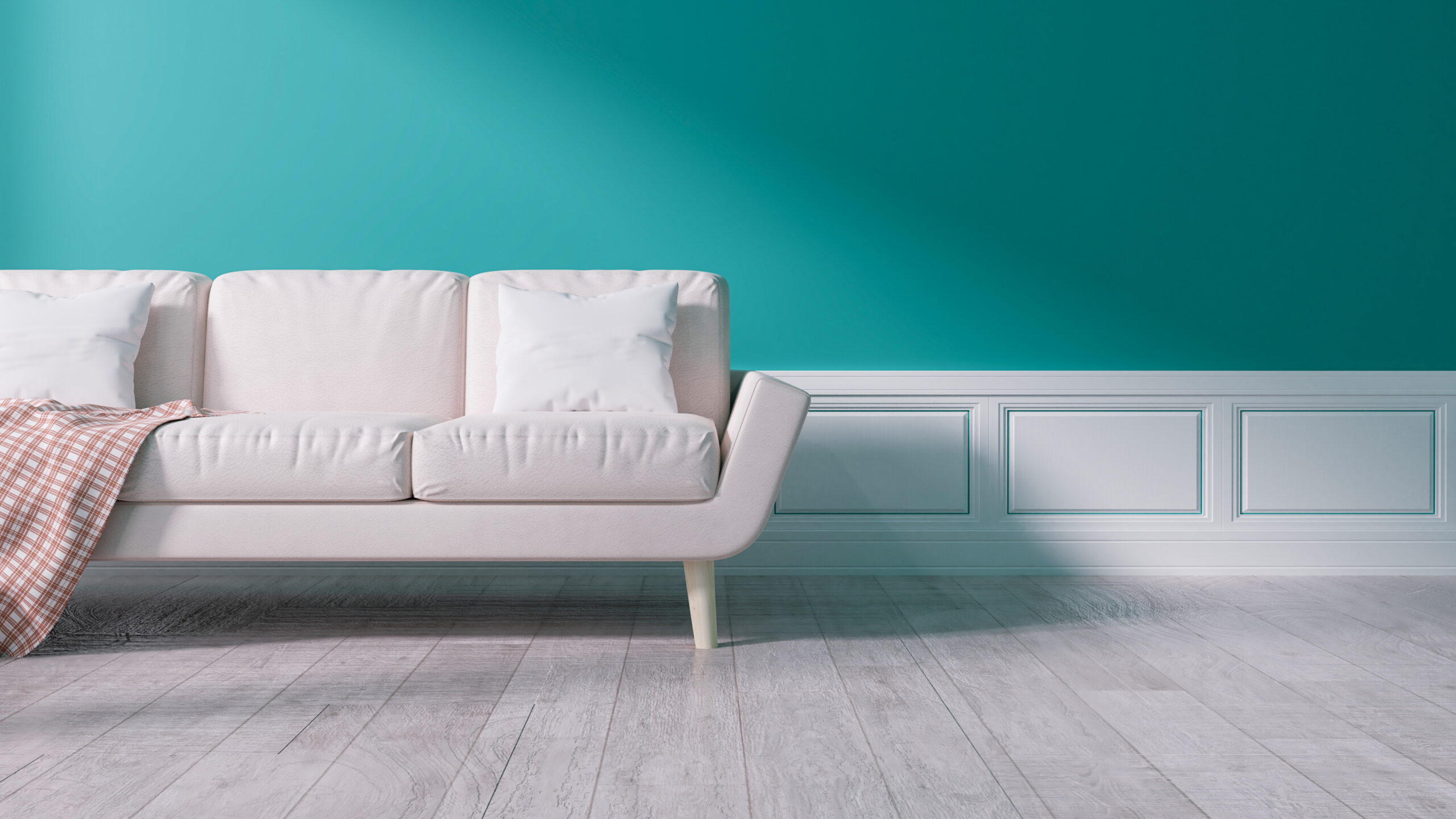
And, don’t forget about browns and whites. These colors create a strong contrast for both warm and cool colors. I usually avoid black or any shades of gray since as our eyes age cool colors can start to look gray. Cool-colored walls may blend with gray walls and you’ll lose the contrast.
Adding High-Contrast Color Throughout Your Aging-In-Place Home
Below are some of my best pro tips for making an aging-in-place home safer with a healthy dose of high-contrast paint in any room.
Walls
The walls are the easiest place to start and will make the most immediate impact to an aging-in-place home. This can be as simple as painting each room in your main living area a different color. It’s the colors you choose that matter most. Avoid picking several shades of one color – that’s not going to give older eyes the contrast they need. Choose colors that contrast – opposing sides of the color wheel – but that complement one another as well.
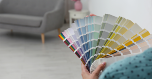
Tip #1: Plan Out Your Home’s Wall Colors in Advance
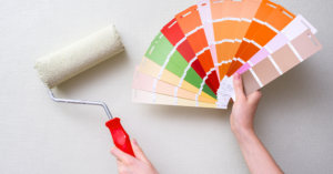
Finding colors that contrast and look good next to each other takes some planning. Work your way through the main living areas and start to mix and match the best contrasting color combinations until you land on a color palette that an adult aging-in-place is going to enjoy looking at.
Tip #2: Try A Bold Signature Wall to Add Contrast Quickly and Easily
You can also add contrast to a room by painting one wall a different, bolder color than the rest of the space. For instance, a maroon signature wall at the far end of a room can help an older adult better make out where the room ends, improving their depth of perception.
To create a signature wall with a bold contrast color, you’ll want a quality cut-in brush and a good amount of painter’s tape since you’ll be cutting in each corner of the wall.

My favorite cut-in brush is the Wooster 2-inch Shortcut Sash Paintbrush. It has a comfortable, ergonomic handle and spreads paint on effortlessly. You can make crisp, precise cuts with this brush so you can get around the entire perimeter of your signature wall fast.

For painter’s tape, I use FROGTAPE. Scotch Blue is another great choice. You want a tape that creates a sharp line and creates a seal between the tape and the wall underneath so no new paint seeps through.

If you’re going with a dark color, especially a deep red, blue or green, a quality paint roller is especially critical. A cheap roller will leave roll lines and stippling behind and you’ll see streaks of paint rather than a seamless finish. The streaks are even more noticeable against dark paint. Wooster and Purdy and my go-to brands for quality rollers and roll covers. Lately, I’ve been using the Wooster Brush 9-Inch Roller Frame and it’s become my new favorite. For the roller cover, I use a Purdy 9-inch White Dove Roller Cover with a 3/8-inch nap. This is a quality roller combination that’s going to help you create the perfect high contrast signature wall.
You can take a look at my article on ‘The Best Painting Tools Out There for Your Aging in Place Home Projects’ for a full list of my all-time favorite paint supplies to learn more about other great products to have by your side as you paint.
Light Switch Plates
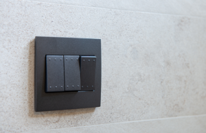
Painting a light switch plate a color that contrasts against the walls you just painted is another easy, quick aging-in-place project that can make a huge difference for an aging-in-place adult. Think about how hard it would be to locate a light switch as your eyes age. Paint the switch plate with a color that makes the switch pop off of the wall. It couldn’t be easier than that.
Tip #3: Remove the Switch Plate Before You Paint
This sounds obvious, but I’ve seen too many DIY painters try to save a little time by leaving the faceplate attached to the wall and painting around the switch. This is a sure way to get paint where you don’t want it. It only takes a few seconds to unscrew the switch plate so you can do the job right.
Tip #4: Make Sure You Have the Best Light Switch for Aging-in-Place
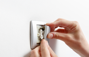
If the light switches in your home are old or loose, now’s the time to fix those while you have the switch plate removed. If your aging-in-place home is old and you have circular push switches or any similar switch that requires aging, arthritic hands to push or turn a small knob, changing those out for a modern switch can help something as simple as turning on and off a light less painful.

I like wide rocker light switches like the Levitron Decora Rocker. The wide switch is easier to move up and down for older hands. These Levitron switches come in a lot of color options – from white to gray to black and a few others in between. Pick a switch that contrasts against the switch plate and you’ll make the switch even easier for an older adult to see.
Doors
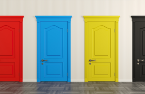
Painting your home’s interior door a color that stands out against the surrounding walls is a great way to create contrast in your home. Thinking back to our color wheel, pick two contrasting colors and use the biggest, boldest color on your door. This splash of color acts similar to a signature wall, making the door even easier for an older adult to see. Painting the deeper of the two colors on the door is also a great way to create serious color contrast without having to commit to such a bold color in an entire room. This gets you the contrast you need while still creating an aesthetically pleasing space for the adult living in the home.
Tip #5: Painting a Door is Different Than Painting a Wall
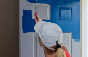
If you haven’t painted a door before, there are some tricks you need to know before you get started. Painting doors can be one of the most challenging inside paint jobs for painter’s because they show every imperfection. And, if you’re choosing a high-impact color, like a bold red or a deep blue, stippling – the lines left behind by rollers and brushes – will be even easier to see.
The painting products you choose are hugely important here. You can choose to roll a door, paint it with a brush, or do a combination of both. If your door has lots of detailing you may want to use a brush to cut in and around as needed.
Use a high-quality brush like the Purdy Pro-Extra Monarch Flat Trim Paintbrush. It’s a 3-inch brush that lets you cover a lot of territory in a little time while giving your door a smooth finish without stippling.

If you choose to roll the paint, a mini roller is the way to go. I love the Wooster Brush Sherlock 4-inch Mini Roller. Pair it with the Purdy White Dove Mini Roller Cover and you’ll have a smooth finish without stipple lines left behind.
Again, don’t miss my article on ‘The Best Painting Tools Out There for Your Aging in Place Home Projects’ for more information on these products and everything else that’s in my pro painting tool kit.
Trim
Giving the trim around your windows and doors a fresh coat of white paint will contrast against just about any color wall. This is another easy way to immediately improve the contrast and the overall look of a room.
Tip #6: When it Comes to Painting Trim, The Right Tools Make All of the Difference

Again, you’ll want to get either FROGTAPE or Scotch Blue painter’s tape and tape off the walls around the window or door trim. For door trim, tape off the door and any hardware. Get a sturdy ladder so you can fully tape around the top of the trim and paint tall trim with smooth, even brush strokes. If you’re painting a window, lay the tape where the window and the trim meet. Even if the trim and window are both white, you don’t want to make the mistake of painting a portion of the window shut.

For any trim work, spend the money on a high-quality trim brush. The few extra dollars you’ll save will cost you tenfold in time and you won’t be happy with the results. I use the Purdy Series Cub Angular 2-inch Trim Brush for a lot of my interior trim projects.
Time to Get Started
Now that you’re armed with these pro painting tips, the hardest part of painting your aging-in-place home should be picking out the color. Taking a weekend or two and painting the walls in your home a fresh, high-contrast color will immediately make the life of an older adult aging-in-place easier and safer. As you get started, use the comments sections below to ask me any questions you have. Good luck with your next aging-in-place project!